项目搭建
起名字
因为要发布到npm上面自己用,甚至给别人用,所以你的组件库名称不能和其他的npm包名重复,来NPM查询一下
首先去 npm 仓库查找curry-design,看有没有人在使用。。
然后我们起一个木有重命名的名字,并新建项目
创建项目
npx create-react-app 项目名 --template typescript执行后,就会下载成功react+ts模版
创建后的目录如下:
配置eslint
在根目录创建.vscode/settings.json,并写入以下配置
{
    "eslint.validate": [
        "javascript",
        "javascriptreact",
        { "language": "typescript", "autoFix": true},
        { "language": "javascriptreact", "autoFix": true},
    ]
}
样式结构
src/styles/variables.scss:各种变量以及可配置设置
src/styles/mixins.scss:全局mixins
src/styles/index.scss:引入组件单独的样式
src/styles/reboot.scss: 即为Normalize CSS
因为我们使用的是create-react-app创建的项目,但是create-react-app不支持scss,需要安装node-sass解决
npm install node-sass --save因为我们做的是组件库,比如像antd design组件库是蓝色样式,所以我们做的组件库也需要设置色彩系统的样式,因为我们使用的是scss,所以我们可以将这些系统的样式颜色通过变量来定义,方便复用。
src/styles/variables.scss代码内容:
reboot.scss代码内容:
接着创建src/styles/index.scss文件,将上面两个文件导入
// config
@import "variables";

//layout
@import "reboot";
接着在src/index.tsx中引入 styles/index.scss文件
import './styles/index.scss';去掉App.tsx中引入的App.css文件
经过上面样式的配置,现在把项目跑起来看下效果:
npm start这样样式部分就算配置好了。
第一个button组件
我们以antd design的Button组件为例,并以最简单的方案实现其中的部分功能
组件通用结构
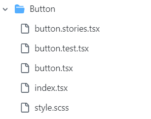
src/components/Button 中的内容:
button.stories.tsx:按钮文档
button.test.tsx:按钮测试用例
button.tsx:按钮组件内容
index.tsx:导出按钮组件
style.scss:样式
开始微操,先处理样式,优势在我
使用ts的枚举定义按钮的尺寸大小,根据上面定义的api,定义如下尺寸的枚举值。
// 默认尺寸为中,所以就不列到枚举里面了。
export enum ButtonSize {
    Large = 'lg', // 大
    Small = 'sm' // 小
}
定义按钮类型的枚举
export enum ButtonType {
    Primary = 'primary',
    Default = 'default',
    Danger = 'danger',
    Link = 'link'
}
定义可以传入到按钮的props
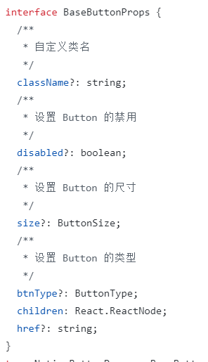
interface BaseButtonProps {
    className?: string;	// className
    disabled?: boolean;	// 是否可点击
    size?: ButtonSize;	// 尺寸大小
    type?: ButtonType;	// 按钮类型
    children?: React.ReactNode;	// 传入的children元素
    href?: string;	// Link类型按钮的href
}
在函数中通过props获取传入的参数
const {
        type,
        disabled,
        size,
        children,
        className,
        href
    } = props;
接下来根据传入的type,size,disabled属性来动态添加className。
这里使用classnames库来组合className(ant-design也是使用了这个哦)。
我们要做成 btn, btn-lg, btn-primary这种格式的className
默认有props传来的className,统一的 'btn',如果传入了type,表示为true,则就添加`btn-${type}`的className。
如果传入了size,则就添加`btn-${size}`的className
如果传入了disabled并且type是link类型,则添加disabled这个className
总结代码如下:
 // btn, btn-lg, btn-primary
    const classes = classnames(className, 'btn', {
        [`btn-${type}`]: type,
        [`btn-${size}`]: size,
        'disabled': type === ButtonType.Link && disabled
    })
接下来根据type来显示是 a标签 还是button标签。如果type是link标签并且传入了href属性,则显示成 a标签,否则显示成button标签。
 if (type === ButtonType.Link && href) {
        return (
            <a href={href} className={classes}>{children}</a>
        )
    } else {
        return (
            <button className={classes} disabled={disabled}>{children}</button>
        )
    }
给Button传入默认的props
Button.defaultProps = {
    disabled: false,
    type: ButtonType.Default
}
在index.tsx中导出button和定义的枚举值
import Button from './button';

export { ButtonType, ButtonSize } from './button'

export default Button
在入口文件App.tsx中引入目前写好的Button组件看下效果。
import Button, { ButtonType, ButtonSize } from './components/Button';

<Button>按钮</Button>
<Button type={ButtonType.Primary} size={ButtonSize.Large}>按钮</Button>
<Button type={ButtonType.Link} href="www.baidu.com">按钮</Button>
因为我们使用scss来写样式代码,所以需要使用node-sass第三方库
npm install node-sass --save-dev编写和按钮相关的样式变量,这样我们就能在任何scss文件中使用这些样式变量,不用在重复编写,只需要修改变量即可。
编写按钮基本的样式,也就是 btn 这个 className。在src/components/Button/style.scss编写如下代码:链接
在这里为了不重复复制样式代码,我们采用mixin来处理。
比如上面代码中的@include button-size 函数,这个是scss的一个特性,可以从官网上看下介绍。(增加该方法,就如同VUE的混入方法类似,传值,接收,使用该返回值),官网
@include button-size( $btn-padding-y, $btn-padding-x, $btn-font-size, $border-radius);要使用上面的方法,需要在mixin编写上面的函数
src/styles/mixin.scss代码:
@mixin button-size($padding-y, $padding-x, $font-size, $border-raduis) {
  padding: $padding-y $padding-x;
  font-size: $font-size;
  border-radius: $border-raduis;
}
省流:相当于在button-size中传了4个参数,使用这4个参数来定义样式属性,使用的时候即可传入对应的样式变量即可。
编写按钮尺寸大小的代码,这里同样适用mixin,使用button-size
.btn-lg {
  @include button-size($btn-padding-y-lg, $btn-padding-x-lg, $btn-font-size-lg, $btn-border-radius-lg);
}
.btn-sm {
  @include button-size($btn-padding-y-sm, $btn-padding-x-sm, $btn-font-size-sm, $btn-border-radius-sm);
}
编写按钮类型的样式代码,这里同样适用mixin,使用了button-style,这就需要在mixin.scss中进行定义
.btn-primary {
  @include button-style($primary, $primary, $white)
}
.btn-danger {
  @include button-style($danger, $danger, $white)
}

.btn-default {
  @include button-style($white, $gray-400, $body-color, $white, $primary, $primary)
}
mixin.scss中定义 button-style。
@mixin button-style(
  $background,
  $border,
  $color,
  $hover-background: lighten($background, 7.5%),
  $hover-border: lighten($border, 10%),
  $hover-color: $color,
) {
  color: $color;
  background: $background;
  border-color: $border;
  &:hover {
    color: $hover-color;
    background: $hover-background;
    border-color: $hover-border;
  }
  &:focus,
  &.focus {
    color: $hover-color;
    background: $hover-background;
    border-color: $hover-border;
  }
  &:disabled,
  &.disabled {
    color: $color;
    background: $background;
    border-color: $border;
  }
}
编写 按钮是 link 标签时候的样式代码
.btn-link {
  font-weight: $font-weight-normal;
  color: $btn-link-color;
  text-decoration: $link-decoration;
  box-shadow: none;
  &:hover {
    color: $btn-link-hover-color;
    text-decoration: $link-hover-decoration;
  }
  &:focus,
  &.focus {
    text-decoration: $link-hover-decoration;
    box-shadow: none;
  }
  &:disabled,
  &.disabled {
    color: $btn-link-disabled-color;
    pointer-events: none;
  }
}
处理事件与其他属性。
定义 button 自有的属性,使用 ts 提供的 & 来将 传入的props和自有的props链接起来
type NativeButtonProps = BaseButtonProps & React.ButtonHTMLAttributes<HTMLElement>定义 a 标签 自有的属性,使用 ts 提供的 & 来将 传入的props和自有的props链接起来
type AnchorButtonProps = BaseButtonProps & React.AnchorHTMLAttributes<HTMLElement>使用按钮组件的时候,上面的props不是都必写,所以这里使用ts提供的Partial<T>,将props变成可选的
export type ButtonProps = Partial<NativeButtonProps & AnchorButtonProps>;这样ButtonProps就是完整的props了,把它作为Button的props,替换掉BaseButtonProps
const Button: React.FC<ButtonProps> = (props) => {}我们使用es6提供的...符,把自有的props传进来,使用restProps表示
 const {
        btnType,
        disabled,
        size,
        children,
        className,
        href,
        ...restProps
    } = props;
将restProps传入给 a和button标签,这样a和button就有了自有的属性
if (btnType === ButtonType.Link && href) {
        return (
            <a href={href} className={classes} {...restProps}>{children}</a>
        )
    } else {
        return (
            <button className={classes} disabled={disabled} {...restProps}>{children}</button>
        )
    }
完整的代码如下
这样就完成了Button组件的开发。
为你的组件增加单测
为什么是jest?
因为,antd单元测试也是jest,我们相信antd严选
而且我们的项目已经自带了,没得选,哈哈哈哈哈哈哈哈哈
我们直接跑下 npm run test 就可以看到单测结果。
测试用例结构
  it("当前一整套操作的内容进行简单描述", () => {
	1.渲染dom元素
	2.判断元素内的文字是否渲染,
	3.判断class是否存在
	4.触发不同的事件查看是否有根据事件成功发生变化,监听异步返回内容
  });
用法简析
主要是用 @testing-library/react 这个库,常用 api:
render:渲染组件,返回 container 容器 dom 和其他的查询 api
fireEvent:触发某个元素的某个事件
createEvent:创建某个事件(一般不用这样创建)
waitFor:等待异步操作完成再断言,可以指定 timeout
act:包裹的代码会更接近react在浏览器里运行的方式
renderHook:执行 hook,可以通过 result.current 拿到 hook 返回值
为你的组件增加文档
antd是这么写文档的呢?
人家直接md梭哈了,我们不行,没这个人力物力,于是我们选择Storybook
Storybook 是非常流行的用来构建组件文档的工具。
提示:Storybook 组件版本不一样,格式语法差距很大,本人采用最新8+版本,网上很多语法都是旧版本的,不如直接看官网与自带的案例来加深理解。
npx storybook@latest init打印的日志告诉你 storybook init 是在你的项目里添加 storybook 的最简单方式。
它会在你的 package.json 添加一个 storybook 命令:
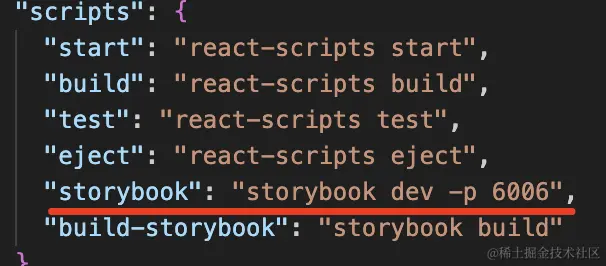
然后我们直接运行
npm run storybook然后,里面就有三个组件,这三个组件不是我们自己写的,是 storybook 初始化的时候自带了三个 demo 组件,可以用它来了解下 storybook 的功能。再跟我的文档对比就可以理解部分用法。
比如在类型上增加注释,就可以在
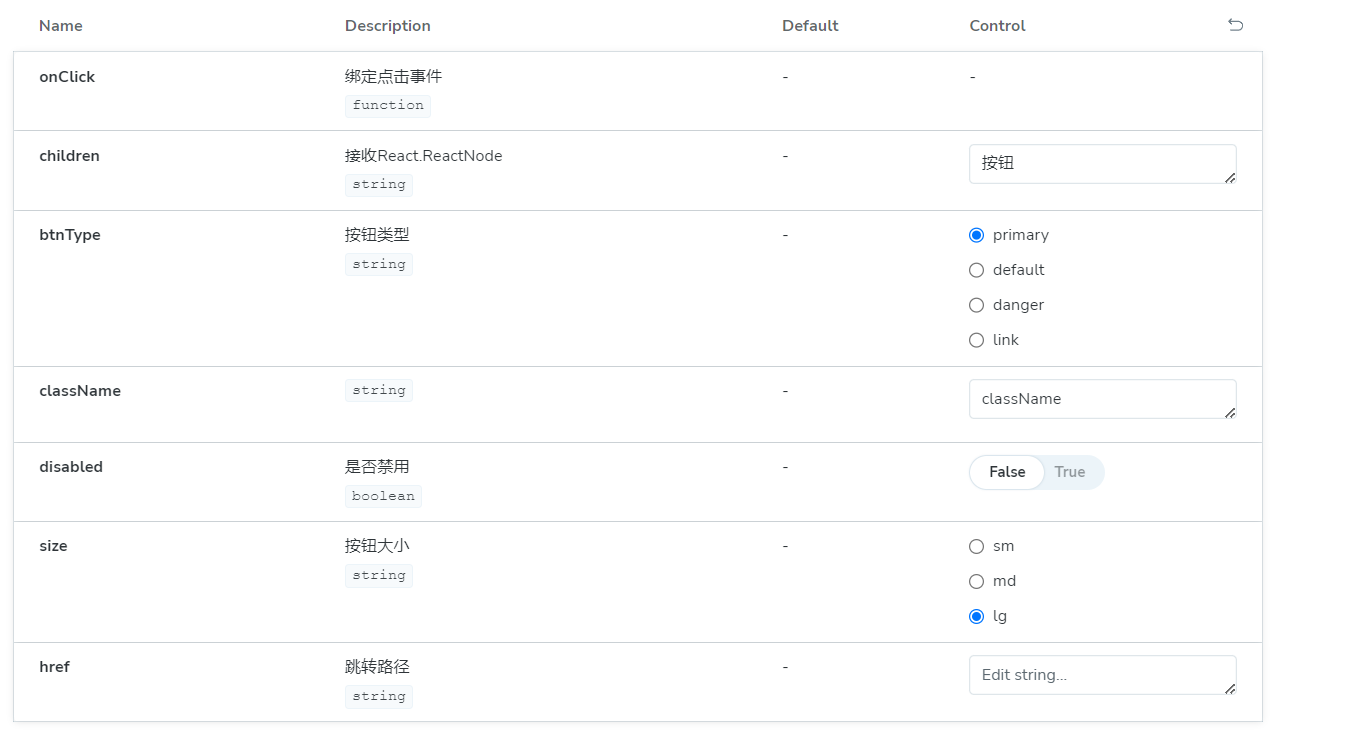
文档中看到Description(描述)中有了正确的翻译,而Default与Control也可以正确的根据TS类型进行生成。
目前Control读取React.ReactNode这种值还是不行,但是传递一个简单对象啥的还是OK的,未来版本继续更新,相信功能也会越来越逆天
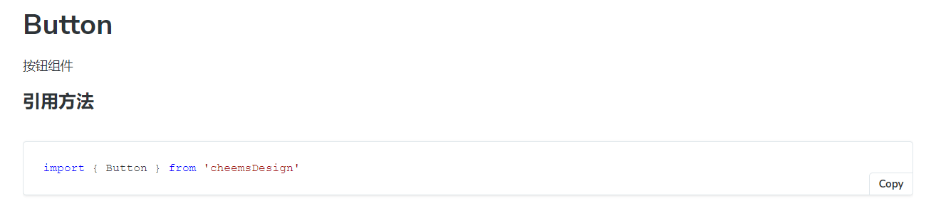
我们在button组件上方增加如下内容
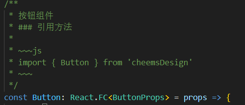
就可以看到文章生成了基础用法,我们就可以使用这种简单的增加注释方式,优化TS类型的方法,来快速实现一个优秀的文档
扩展:这玩意还支持自定义渲染,在线单元测试:@storybook/jest
我们还可以在src/stories/Configure.mdx内编写我们的组件库首页。具体内容查看我的源码(很多东西写的不好,比如hooks查看当前源码这一块,因为使用引入demo的方法来放置渲染内容,导致没用读到demo代码)。
发布你的组件库到NPM
打包
新建tsconfig.build.json用来打包TS
{
    "compilerOptions": {
        "outDir": "build",
        "module": "ESNext", // 输出的类型
        "target": "ES5",
        "declaration": true, // 生产.d.ts
        "jsx": "react",
        "moduleResolution": "node", // 按node方式加载模块
        "allowSyntheticDefaultImports": true // 允许 import React from 'react'方式引入
    },
    "include": [
        "src"
    ],
    "exclude": [
        "src/**/*.test.tsx",
        "src/**/*.stories.tsx"
    ]
}
使用node-sass打包sass
"build-css": "node-sass ./src/styles/index.scss ./build/index.css"最终命令
    "clean": "rimraf ./dist",
    "build": "pnpm run clean && pnpm build-ts && pnpm build-css",
    "build-ts": "tsc -p tsconfig.build.json",
    "build-css": "node-sass ./src/styles/index.scss ./dist/index.css",
发布
package.json要增加以下内容
repository:仓库地址
"files": ["dist"] npm上传的包位置
“keywords”:仓库搜索关键词
登录并发布npm
npm publishCI/DI
没搞,部署到自己服务器上一个,然后弄到my3v一个·
大家可以跟我一样部署自己的服务器,或者看看CI/CD部署到github或者vercel上。